Modern Master Bath Remodel

My clients, Dawn and Ray, chose a classic 1990’s vintage home for its quiet neighborhood and easy walk to school and library.  This was a three bears kind of house – not too big, not too small – just right.  Dawn is a children’s book writer and artist.  And, you could say that she began to re-write the story of this home from the moment she moved in.  It has been fun to watch her sort it out and find the way, relying on her own artistic sense.

Her latest project has been the master bath…

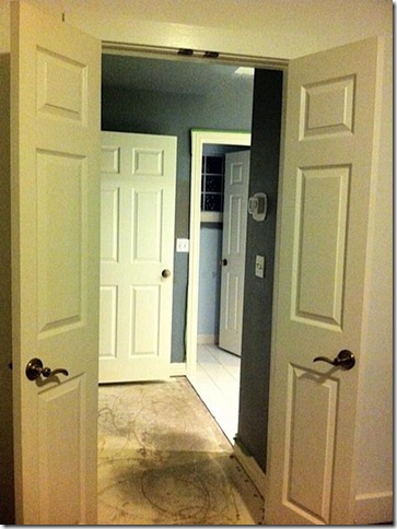
Entrance to Master Bath

Here is the entrance to the Master Bath – typical 1990’s style, with panel doors, beige carpet, white tile, and big 6″ cans in the ceiling.  Mostly, the space was kept as is, but that wall on the right with the thermostat had to go!

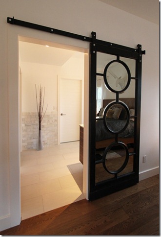
Barn-door

Wow!  See the difference?  The door was made from a large mirror that Dawn had intended to hang.  Kai Mueller, her carpenter, added hardware to create a barn door that glides along the wall.

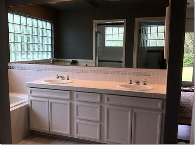
Vanity

Here is the original vanity, with mirrored wall, accent tiles, and chunky cabinet doors.

Vanity-Mirror

Ahh!  Now there is a sophisticated new vanity!  Home Depot installed the white Silestone counter.  Faucets are California Faucets from Ferguson Plumbing.  Candle sconce lights, by Sonneman, were ordered from All Modern.

Vanity-new

Kai Mueller made the floating vanity cabinet and mirror frame from walnut hardwood.  Hardware was selected to go with the faucet style.  Find the pulls at Lowes or Ikea.  Binswanger Glass installed the mirror glass and shower door.

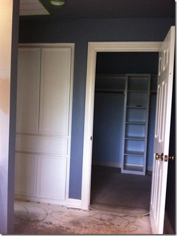
Linen Closet

Here’s a glimpse of the old linen cabinet and main closet.

Towel-storage

A set of deep drawers and upper cabinet replaced the old linen/clothes hamper.  So pretty and functional!

Tile-floor

The white walls and floor contribute greatly to the simplicity and expansiveness of the space.  Walls are Simply White by Benjamin Moore.

Crown molding was removed, and ornate door and base trim was replaced by a contemporary 1″ x 6″ style.

Floors are 12” x 24” porcelain tile from Floor & Décor.  They have a light ribbed look, which adds to the organic feel.   The mirror in the closet opens to reveal the shelves behind.

Master-bath-before

A look back at the original space – very pretty, but not in the modern style that Dawn loves.

New M Bath 5170 600

The tile adds some texture and natural color to the walls – a subtle, stone-like color.  Tiles are honed marble, 2” x 4″ subway style, from Floor & Decor.  The shower floor is done in flat river rock.

By working with the existing plumbing and space layout, Dawn avoided unnecessary cost and difficulty.  She kept the focus on modern styling, and used readily available materials.  The result is clean, modern, serene – and very doable.

BTW, Dawn tells me that the glass block window is on the hit list.  This story’s not over!

Chelsea Moor Makeover: Rediscovering White

We used to love white on interior walls.  In fact, our paint of choice was “mixing base white with white pigment added.”  However, over the last 10 years, we moved toward color.   Warm colors like taupe, beige, and whole wheat seemed necessary for warmth and style.  White seemed stark or unfinished – like primer on the wall.

So when it came time to choose a color for Chelsea Moor, we put up some color samples.  Balanced Beige (Sherwin Williams) was a contender – a beige-taupe.  When we put it up, the strong light in the room washed it out, and an underlying pinkish tone showed up.  (Not good.)

This is counter-intuitive, but I think that low light rooms need color – even dark colors – to add richness to the space.   In strong light, paint colors tend to lose their richness and depth.

Color on walls ,with white on the ceiling, tends to highlight the shortness of the 8′ walls.  And because the living room ceiling was vaulted, color against a white ceiling would create a distracting angled line.

Actually, these walls were screaming for white.   But which white would be right?  Picking the right white is no small matter.   I turned to Remodelista – a design source that I read daily.  Their post on whites most used by architects was a great help.   The top choice for an all purpose white was White Dove by Benjamin Moore.  They called it “clean, calm and a great backdrop for art.”  Since we use Sherwin Williams, I chose a close match – Greek Villa.

We painted the walls, ceilings and trim all the same – flat paint on the walls and satin on the trim.   The white color expanded and simplified the space, making the walls a backdrop for a more important element – light.

Diniing-White-600 - Copy

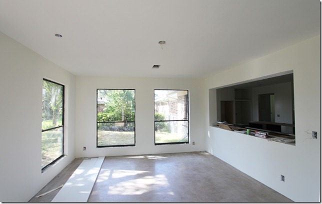
Dining room in process:  Sunlight streams in and bounces off walls creating an active, changing environment.

Sunroom-3215

Dining room before:  The dining room was made from this cabin-like sun room.

IMG_4750 - Copy

Dining Room in process:  An underlying design goal was to connect the interior to the outdoors.  Landscaping will help the “outdoor room” rise to the occasion.  There will be no window coverings.  No window coverings at all.

Kitchen-white-600

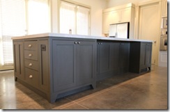
Kitchen taking shape:  Architectural features are highlighted by soft shadows.  The island and base cabinet were painted a dark grey (Porpoise by SW) to ground them and connect to the concrete floor.

Kitchen-3177

Kitchen before:  We incorporated the old breakfast area  into the new kitchen.  The kitchen opens to the new dining area, which was the old sun room – behind the window on the left.

Kitchen


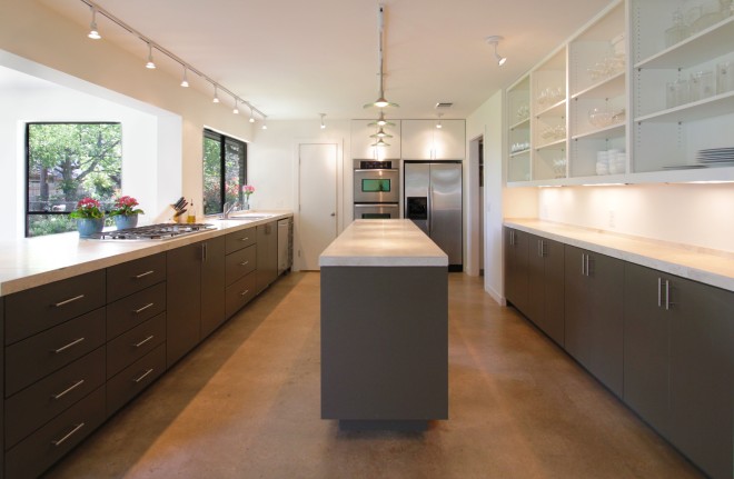
Here’s the new kitchen!

Thanks for sharing our Chelsea Moor remodel!

Roselind Hejl

www.weloveaustin.com

Chelsea Moor Makeover: DIY Concrete Waxing

Foyer Office 5052 copy 600 Lo

We love the cool, hard surface and relaxed lifestyle of a concrete floor.  The photo above is from our own house.  John and Marie wanted to have a similar floor in their Chelsea Moor remodel.  They like the mottled, imperfect look of unstained concrete.

We have waxed concrete floors several times in the past on new construction, so have some experience in this.  However, the Chelsea Moor project involved re-finishing old abused concrete.  So, before waxing, we had to work through two levels of preparation:

Chelsea Moor Makeover: DIY Concrete Refinishing

Chelsea Moor Makeover:  DIY Concrete Patching

IMG_3692

Now it is time for the waxing.  We have an Edco Floor Maintainer, bought from Lowe’s rental department for $270.  This is a heavy machine.  It takes two people to lift it out of the truck.  A stiff brush attachment fits on the bottom.   The brush builds up heat as it turns and burnishes the wax into the concrete.

IMG_5769

The wax we use was Stone Tone Wax by Kimiko, purchased at The Stain Store in North Austin.  It may be bought in oil or water base.  The oil base wax tends to darken the concrete a little more than the water base.

IMG_5800

How-To:

First, pour some wax into a small plastic container to work from.

Then pour about 1/2 cup wax on the floor.  If you pour  too much wax at once it will not burnish into the concrete fully, and will leave a sticky residue.

Plan to cover about a 4 x 4 foot area with 1/2 cup wax.

Run the heavy buffer over the wax slowly to spread it and rub it into the concrete.

Continue buffing for about 5 minutes to built up heat and burnish the wax into the concrete.  The wax fills the pores and seals the concrete.

IMG_5770

The color of the concrete will darken slightly when the wax is put down.  Here you can see the color enhancement in the waxed area.

IMG_5805

The waxed floor will be slightly glossy and smooth to the touch, similar to a smooth stone.

The re-use of old concrete is a green choice.  Concrete lives well – it does not hold dust and is very easy to clean with just a damp mop.  And, the clean hard surface goes well with modern simplicity.

Concrete Experiences – Round One

Concrete Experiences – Round Two

Concrete Experiences – Keeping Cracks in Line

Thanks for sharing our Chelsea Moor makeover!

Roselind Hejl

www.weloveaustin.com

Chelsea Moor Makeover: DIY Concrete Refinishing

We have used concrete as a finish floor on new construction before (see links at bottom), but these past experiences had not prepared us for refinishing old concrete.  It took some true grit to deal with the mud, the dust, and the backbreaking labor of this job.     

At Chelsea Moor we had several concrete floors.  Most of the house was poured in 1978.  There was an addition, ten to twenty years later.  And, there was the concrete we had just poured in the living area to raise the floor level.

Floor-paint-600-142 IMG_3608  

Old Paint and Glue

The old 1978 floor had a lot of paint on it from the original construction.  In those days no one considered concrete as a finish floor, so they had no reservation about spraying the floor along with the baseboards. 

The kitchen and bath floors were coated with glue and backing from old sheet vinyl.  And, in the sun room, there was a tough layer of glue left from the outdoor carpet.  

We wanted to clean the floor and unify the several concrete vintages by grinding off the top layer of concrete.  What to do and how to do it has been a process of discovery.  We had to search the internet, call rental places, and bother people to figure out how to get this done.

IMG_3692

Hex Pins and Sander

We hoped to make do with our own machine – a Clarke Floor Maintainer, purchased from Home Depot for about $270.  They sell their rental machines when they are ready to replace them.  This machine can be used for waxing concrete, which we have done several times in the past. 

This machine can also take a hex-pin attachment from Pearl Abrasives, which was supposed to take off the paint and glue.  We rented the hex pin attachment from Home Depot.  The hex pin attachment  took off some of the surface paint, but would not remove the deeper paint that had penetrated the surface of the concrete.  It made a whole lot of dust.  Strike one.

The guy at Home Depot loaned us a sander attachment, and we bought a couple of sand paper disks.  The sander did about the same job as the hex pin. We tried putting water on the floor to reduce dust, but the sanding disk quickly became coated with gunk and would not work.  Strike two.

009

Stone Grinder

Several rental places recommended a stone grinder.  This is an Edco machine, which we rented for about $300 for a week.  It weighs a ton.  You rent the machine, but buy the stones.  We bought a set of each stone texture – course, medium, and fine.

When water was put on the floor to reduce the dust, the stones clogged up with gunk and would not work.  They had to be taken off and cleaned.  Fortunately, we found that if you put down a lot of water it kept the concrete slurry thin, and the stones did not gunk up.   (So back in business.)

We used a floor squeegee (from Home Depot)  to pull the slurry into a pile, and a wet vacuum to clean it up.  

The machine cleaned the floor, but was not sharp enough to hone off as much of the concrete surface as we wanted. We were not satisfied with the result.  So, strike three, sort of.  

048

Diamond Grinder

We went back to Home Depot and bought a diamond disk for a hand grinder that we happened to have.  Baldo and David took turns going over the floor with this.   

The diamond blade was a more aggressive tool than the stones.  It took off a thin layer of concrete.  We did the whole 2,200 square feet with a small hand grinder.  The blade had to be replaced at one point.  Then the hand grinder burned up and had to be replaced.  (We could not find a place to rent a large diamond grinder, but would manage to do this next time.)

022  003

Diamond Grinder + Stone Grinder

After a pass with the diamond grander, we followed behind with the stone grinder to smooth the surface and take out swirl marks.   

The mud slurry from the grinding had to be vacuumed with a wet vac.  This was a hard job in itself.  Even with water on the floor, a layer of dust coated everything – even the walls and ceiling. 

We used a heavy duty fan to keep the dust off our two workmen, but even with the wind chill, it was about 95 degrees in the house.  The neighbors wondered about the clouds coming out the windows. 

032

Final Result

The grinding and cleaning took about 9 days all total.  I’m waiting for amnesia to set in, but we liked the final result.  It is clean and speckled with some of the sand and pebbles.  The color ranges from grey to tan color.   This is a rustic surface with mottled color, a few cracks, and some patches where nails had been pulled.  But we love it for its imperfections.  It’s the easy living floor – and it was there for the taking.      

Concrete Experiences – Round One

Concrete Experiences – Round Two

Concrete Experiences – Keeping Cracks in Line

Thanks for sharing our Chelsea Moor Makeover!

Roselind Hejl

www.weloveaustin.com

Chelsea Moor Makeover: I Turned My Camera On

(Guest post from Marie Hejl –   http://cocinamarie.wordpress.com/ )  

And that’s pretty much all I did on this phase of the project.  As you’ll see from the pictures, my dad, my husband, and our trusty contractors deserve all the credit for the next phase in our home remodeling process.

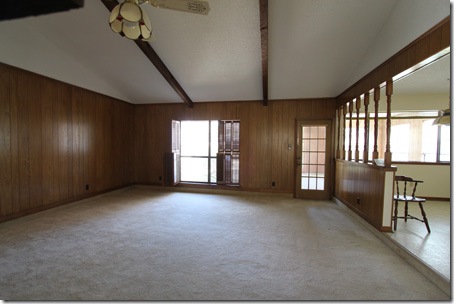
When John and I bought the house, the living room had wood paneling on the walls, carpet on the floor, and thick wood beams on the ceiling.  Here is a picture of the room in its original form.

For reference, the breakfast room and kitchen are located on the right side of the picture above.  The picture below provides another view of the breakfast and kitchen area from the living room.

There were a number of issues that we wanted to correct in this space.  In addition to removing the paneling and carpet, raising the sunken floor, and re-doing the fireplace (see previous post), we wanted to connect the living, dining, and kitchen areas in a way that would be suitable for large family gatherings, dinner parties with friends, as well as occasional cooking classes (and possibly another cooking show!).

With those goals in mind, the first step was to remove the paneling and carpet, along with the beams on the ceiling, and the half-wall (and lovely spindles) between the living room and breakfast area.

Then we had to deal with the back wall, which contained an off-center window, some awkward wall space, and a door leading to a sunroom.  For us, the sunroom would have been wasted space.  We decided to make the sunroom into our dining room, and we wanted this new dining room to connect to both the living room and kitchen.  To achieve this connection, we removed the door to the sunroom and part of the adjacent wall, thus, broadening the opening between all three of the spaces.

Next up?  The window.  The original placement of this window truly did not do the house any favors.

The window looked out to an inaccessible and poorly maintained outdoor space—crammed between the walls of the dining room (on the left) and the master bedroom (on the right).  In removing the window, our goal was to allow this outdoor space to serve as a connection—rather than an obstruction—to the backyard.

And it looks better already!  The living room now opens to a partially-shaded area (soon to be a rustic limestone patio), providing a seamless connection to lush green grass and mature oak trees.

Here is the view from the inside.  We had to use some temporary supports before the actual framing (hence, the two-by-fours from ceiling to floor).

Here, the framing is complete.  Then it was time to bring in the sliding glass door.  Although we considered using double French doors, we decided that a large sliding glass door would be a better fit (more modern, less colonial) for our personal style and the intrinsic structure of the house.

As it turned out, the sliding glass door was indeed very large, and very, very heavy—weighing nearly 300 pounds!  It took four strapping young (er, middle-aged) men to move it from the truck to the back of the house.  Not an easy job.

Once they got it this far, my dad realized that we did not have enough of the glue that we needed to secure the door to the concrete.  So John ran to Lowe’s to pick up the supplies.  And my dad (wisely) took that extra time to re-read the instructions for the installation of the door.

Now, they’re back at it.

Finally, the door is in place.

After a making a few final adjustments, the installation is officially complete.

Here is a view from the inside.  It is just what we wanted!  Open, connected, and appropriately modern.

Thanks for sharing our Chelsea Moor Makeover!

Roselind Hejl

www.weloveaustin.com

Chelsea Moor Makeover: Sunken Living is Weak Link

Like many homes built in the 1970’s, a step down into the living area was an established design feature.  This is not the sunken living room, aka conversation pit,  that was popular in the 1960’s.  This is a small change in floor level that signals a transition in the space.  As plans became more open, floors, instead of walls, defined rooms.    

  450-Living-stepdown-3162

As you can see, the entry steps down from tile to plush carpet in the living.  Level changes were used to clarify spaces.  But, was this a good idea?

Not in this case.  The problem here is that the traffic pattern to other main rooms is down the side of the living room.  People have to watch their step, and fear of falling is not good design.


450-Living-stepdown-23464

The plush carpet came up the wall a bit (ugh!) to cover the step ledge, as you can see  from the glue.  This is the step up into the kitchen.

450-FP-Brick-down-3433

So we decided to pour a concrete layer to level up the floor.  To prepare for this, we took out the old entry tile, plush carpet, fireplace hearth, plus the cabinet and stone wall.  Here’s how it looked during demolition.  

450-floor-pour-3665

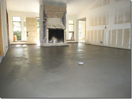
Here is the space with the new concrete floor, poured over the entry and living room.  Now all spaces are on one level.  The dropped living room was a weak link in the chain of spaces.   Now the spaces flow together, and we have a stronger plan.    

We used Roberto Trejo – 923-8164. He specializes in small jobs. We were very happy with his work. He brought in the concrete by wheel barrow. They installed a grid of #3 rebar, 16″ on center, across the floor. Plus they doweled into the existing slab around the perimiter with short pieces of rebar.  The surface was hand troweled to a very smooth finish.

More on the concrete floor finishing process later…

Thanks for sharing our Chelsea Moor Makeover!

Roselind Hejl

www.weloveaustin.com

Chelsea Moor Makeover: Sun Room Converts to Dining Room

At some point in the life of Chelsea Moor, an addition was made.  This may have been called the Sun Room, since it is nearly all windows.  The windows bring in beautiful eastern sunlight. 

450-addittion-3131

   
The addition was built onto the back of the house in an ill considered way.  It sits in the middle of the outdoor space where the patio was located.

450-Old-Patio-3133

We will have to make good use of the outdoor space that was left between the addition and the house.  It is now an unused area with a sickly shrub.   Those pink concrete pavers served as a sad patio.     

450-Beams-3166

The Sun Room was isolated from the main house.  It was entered through the glass door at the end of the living room.  Since the living room was “sunken” there was an unexpected step-up when the door was opened.  If you had not already stumbled off the step-down into the living room, you definitely will trip here.

450-Sunroom-3214

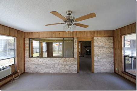
Here is the view from inside the Sunroom.  The exterior stone wall and the window into the kitchen make it clear that this room is not a true part of the house.  To complete the added-on look, there is a window AC, gas heater, outdoor carpet, and wall paneling. 

450-Sunroom

In our plan, the Sun Room is going to be the new Dining room.   We wanted to make this space a real part of the house – visually connected and fully used everyday. 
    

Sunroom-stone-wall-3405

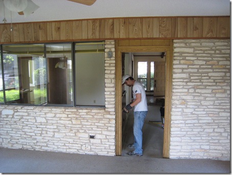
To accomplish that, we needed to break down the wall.   Thanks to Craigs List, both the window and stone found new owners. 

Sunroom-opening-up-3483

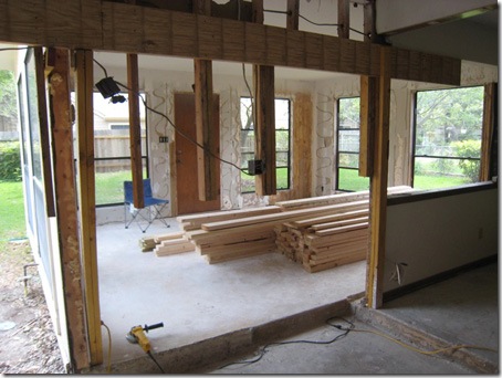
With the entrance to the new dining room opened up, the living, kitchen, and dining spaces now flow together.

450-openwall-dining-3616

The new dining room is filled with natural light and will be a wonderful place to eat everyday.   

Thanks for sharing our Chelsea Moor Makeover  project!
Roselind Hejl
http://www.weloveaustin.com/

Kitchen Cabinets – Room for Improvement

When planning a kitchen remodel, often the center of attention is the finishes.  Which countertop to use?  Should you paint or stain?  Is stainless still in?   Before you pick colors and finishes, don’t miss the chance to improve your kitchen in a fundamental way.  Here are some simple ideas.   

Traditional Drawer-Over-Door Style

For decades, the standard pattern for kitchen cabinets has been “one shallow drawer over one cabinet door.”  The impracticality of this design makes its continued use really astonishing.  Yet, we still see it today at all price levels.  Typically, the door opens to a 24” deep box divided in half with one shelf.  This box offers a poorly accessible volume of storage space.  The front half of the space is readily available, but the rear part is dark and difficult.  Items in the back are seldom used and often forgotten. 

Kitchen-3-350

Expensive cabinetry may contain some pull-out shelves.  These are very shallow drawers behind the cabinet doors.  They help to make the full capacity of the space useful, but the doors must be fully open before they can be pulled out.  Pull-out shelves improve on the poor initial design, but are not a great solution.     

Because this drawer-over-door style is so fully ingrained in the culture of kitchen design, we typically see the sink cabinet with a false drawer or panel above two short doors.  Sometimes the panel is hinged and can be pulled back to create an awkward little v-shaped box for storage of sponges and scrubbers.  This quickly gets icky and water stained. 

Tall Doors with Banks of Drawers

A simple modification would be to remove the false drawers from the sink cabinet and make the door full height.  This modification makes the space under the sink much more accessible.  Under-sink space is typically devoted to trash, recycling, and cleaning supplies.  We sometimes see new cabinet designs that offer a tall trash drawer for waste containers.  However, these pull out trash bins interfere with easy movement in the often congested sink area.  The simple modification to full height doors in the sink area makes trash receptacles under the sink more accessible.  They can be used, and then hidden from view behind the doors.   

Continuing the concept of full height doors, you will find that they can be used to make all the base cabinets more accessible.  You can then organize drawers into vertical banks of three or four drawers, depending on the desired depth. 

The drawer-over-door arrangement began in a time when drawers were built without supporting hardware.  Drawers would fall forward when opened.  They had to be small to avoid making them too heavy. 

Cabinet hardware today makes deep, wide drawers possible and practical.  Banks of drawers take maximum advantage of the storage capacity of a typical 3’ high and 2’ deep base cabinet.  They are a joy to have in the kitchen.  Your stuff stays naturally organized, and is easy to store and find.

Kitchen_island_2874_300

Wall of Shallow Cabinets

If possible, incorporate some shallow base cabinets of 12” to 15” deep.  These tall cupboards are an ideal complement to the banks of deep drawers.  They offer shelf storage that is well suited for appliances and heavy items.  You won’t have to get down on hands and knees to dig out the blender.  Everything is right up front in easy reach.

Wall_cabinets_VERT_2860_300

Open Shelves

Open shelves on both upper and base cabinets have become very popular.  Young homeowners are doing away with doors altogether, and re-defining what can be visible.  Even if your style is more traditional, some open shelves will add interest and some nice display space to your kitchen.     

A good kitchen must start with the basics – a good arrangement of work spaces, storage, lighting, and appliances.  An integral part of this is well designed cabinetry with spaces that are accessible and practical.  If your cabinets have room for improvement, don’t miss the opportunity when designing or remodeling your kitchen. 

If you have a real estate question, please feel free to call or email.

A big thank-you to all of you who have sent us friends and associates who need to buy or sell houses!  Keep sending!

Join me on Linkedin  and  Facebook

Austin Home Design 2010

Led by the green movement, modern design with clean lines and a good connection to the outdoors will be the strongest housing trend in Austin for 2010. Buyers today are well aware of housing design styles as they happen in real time. They watch home makeovers on television, receive décor catalogs in the mail, and browse through home magazines in line at the grocery store. They simply open their laptops to experience the latest, most creative ideas. Homebuyers today want their homes to express themselves and their interests.

Less Is More

The interest in green living, combined with the economic slowdown has led to a more efficient use of space in homes. Smaller homes with clean lines, open floor plan, and less stuff appeal today’s buyers. They are interested in livability, rather than showiness; personality, rather than pretention. Vaulted ceilings are out. Large media rooms and formal living rooms not connected to core areas are out. They are being re-invented as studies or home offices. A growing number of buyers work from home. Old garage apartments are finding new life as office space.

Hard Surface Floors

The green movement and modern design have both contributed to the use of hard surface floors. Carpets hold dust mites, dirt, and allergens. Bamboo, which grows a foot per day, is an attractive and sustainable choice. Other popular floors include concrete, stone, cork, natural linoleum, and rubber. Ceramic tile continues to be a good fit in baths and kitchens.

Mid Century Modern

Younger buyers are breathing new life into their grandparents’ mid-century modern homes. Geometric patterns and big flower prints from the 1950’s and 60’s are back in style. Vintage wallpaper on an accent wall is a great find. Marimekko, Danish modern, IKEA, Eames, and modern American furniture are a perfect fit with today’s styles. Sparse décor, hard surface floors, white walls, and extensive glass areas create a clean, simple look. Complexity is out, simplicity is in.

Eclectic Combinations

Traditional homes are being updated with sleek finishes, such as industrial light fixtures, flat cabinet doors, hard surface floors, and exposed windows. And, as the same time, modern style homes benefit from vintage or rustic touches. Open shelving in kitchens and baths are in. Stainless steel appliances are still a good fit. Bathrooms are smaller, but closets are still generous. Today’s flat screens fit in easily, and the trend is to have them in places like kitchens or baths. Modern design with a retro feel will be the leading edge in the next five years.

Move Over Granite

In the recent past, to upgrade a house was to “granitize” it. Today’s buyers want new choices. Recycled glass is a green inspired choice. Engineered stones, such as Cesarstone and Silestone, are growing in popularity. Soapstone, long used in labs, is in demand. The organic look of limestone, concrete, and marble have a following. Stainless steel is a good fit with modern styles.

Turquoise Is Back

Pantone, a color authority, has declared turquoise to be the color of the year for 2010.

Here is what’s out: Heavy faux; red and gold; thick wall texture. White and off whites are in. Pastels are in. Taupe and grey are combined with white for a sophisticated look. Deep colors such as turquoise, chocolate brown, and plum are used in moderation.  A soft organic pallet, such as cream, sisal, and raw wool is in. On wood, both the natural bare look and dark stains are used.

Outside is In

Buyers today want more connection to the outdoors. This is expressed in several ways. Glass doors that open the whole room to a patio are exciting. Screened porches have made a big comeback. On small urban lots, large glass areas may open to a private courtyard. Backyard gardens, covered patios with outdoor kitchens, and pools are all favored by today’s buyers.

Dining Area: A Core Space in the Home

A-004dining 

Sitting down for a meal is a central function in the design of a home. The space for dining can range from a grand hall to a counter with stools in the kitchen. Dining spaces are as various as houses themselves.

Many homes have a separate formal dining room. Though used only occasionally, this area is often the most elegant and best furnished room in the house. It sets the design style of the house. There is something romantic about sitting down in a room especially devoted to the dining experience. Even the simplest food looks special on your best china in a formal dining room. It is a more private and serene place, separate from the work area and clutter in the kitchen.

Sometimes formal dining rooms develop a rigid, impractical look, more suited to viewing than eating. There are lots of creative ways to personalize a formal dining room to make the space feel safe and comfortable. Consider using a formal table with mix and match chairs, modern placemats, bright colors, assorted candle holders, and lamp lighting. The trend is away from having carpet in dining areas – giving the room a stuffy, impractical feel. Hard surface flooring is more inviting and can take the spills that inevitably happen.

In addition to the formal dining, there is usually a breakfast nook or a central counter for everyday meals. Although the formal dining is separate from the kitchen, it should be easily accessed from the kitchen. The passage to the dining may contain a butler’s pantry – cabinets for serving dishes or glassware.

A less formal alternative is to have the main common areas – kitchen, dining and living – all combined into one large space. Guests feel close to the core of the home, and can participate in cooking or mill around the living and dining area. This is a fun, open style that draws people together to cook, eat, and visit. A successful sequence is to have the spaces move from the most protected to the most outdoor – from the kitchen, to dining, to living, to porch.

Regardless of its location, the dining area should have enough space for a good sized table and at least one additional piece of furniture. Dining areas need natural light from windows or doors. Natural light makes food more appetizing. Dimmers to soften interior lighting at night are a good idea. The dining area is a core space in the house – a place for the important activity of eating and entertaining. How this space is configured, either as a separate room or a part of the living area, depends on the style of your home, degree of formality, and your personal preference.